
#GAFE Impact Report: Part 1 - Overview & Infographic
Monday, January 4, 20167:05 PM

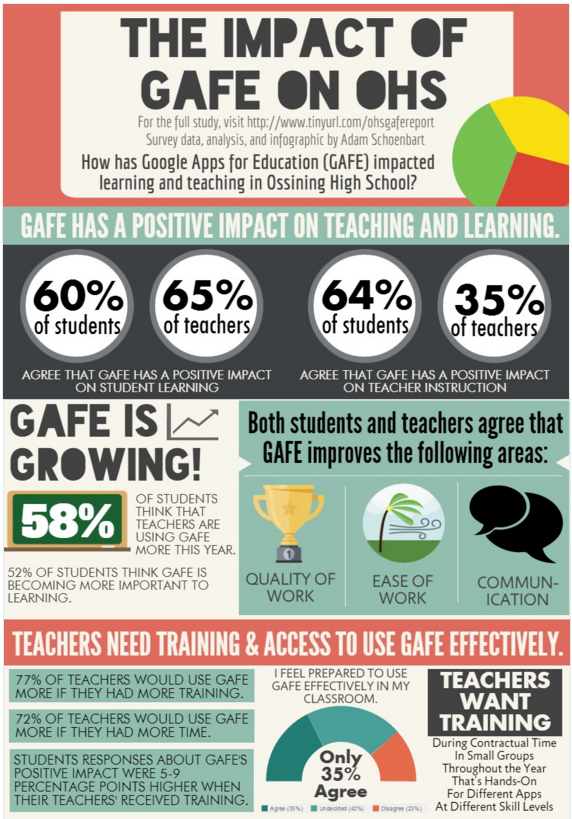
What impact does #GAFE have on teaching and learning?
Last year, this was the question on my mind. I had just left GAFE Summit NY, one of my first conferences, and was awed at how much everyone was talking about the positive impact of Google Apps for Education (GAFE), Chromebooks, and technology. I attended great sessions, watched my Director of Technology discuss our district’s Chromebook rollout and professional development models, and I even presented about how GAFE has changed my teaching and my students’ learning. But I left wondering about the real impact, which at the time meant numbers for me.
We spend two days sharing, learning, and connecting about the power of educational technology but it was all anecdotal and qualitative. Almost no one had any hard facts, numbers, or answers regarding how GAFE impacted student learning or teacher instruction. And I wanted answers.
I spent the next few months planning and discussing my ideas, which resulted in a school-wide survey for all teachers and students about the impact of GAFE. I now realize that the data really focuses on perceptions, not impact, because there simply isn’t about data or literature about the topic yet. Still, I’m proud of the work and think it has valuable findings.
The Plan
In December 2014, I surveyed my school, Ossining High School (OHS), using a Google Form. The entire student and teacher population of Ossining High School was sent the survey electronically to examine the impact GAFE may have on student learning and teacher instruction. At that time, OHS was in its second pilot and year of GAFE and Chromebook integration. 47% of students and 43% of teachers responded, representing all grades and subject areas.
I spent a long time in the weeks that followed analyzing the responses and examining the data.
Over the next few weeks, I plan to share those results here. The data may be isolated to my school, but I believe the results to be important and representative of a larger population.
As I move forward in my doctoral research, I see more action research in my future. While I now realize the limitations and flaws of this particular work, particularly the inability to truly measure impact yet, I think the data is still meaningful and representative, not only of my school but of shifts in the larger #edtech landscape.
Part 1: Infographic
The infographic below details an overview of my findings. View the full Piktochart here or by clicking the image.As I move forward in my doctoral research, I see more action research in my future. While I now realize the limitations and flaws of this particular work, particularly the inability to truly measure impact yet, I think the data is still meaningful and representative, not only of my school but of shifts in the larger #edtech landscape.


2 comments
Adam,
ReplyDeleteThank you for taking the considerable amount of time to document your high school's experiences integrating new technology in classrooms. I appreciate your dedication to this cause! So little is shared with transparency regarding positive and negative experiences with new tools to help guide other teachers venturing forth in uncharted waters. Please continue documenting your thought-provoking experiences.
Thank you for reading! I think opening the door to what's going on in classrooms and with student learning is essential in telling the story of education today. I appreciate your comments and time.
Delete